Thursday, December 8, 2011
Exhibition Banner

Ouma Rusks Relaunch Campiagn


Ouma Rusk Relaunch Campaign was designed for the Foodcorp Competition. Working in a group of two we came up with the concept of "You can't choose your family but you can choose your Ouma." This relates to the variety of flavours Ouma Rusks offers as well as the different types of members of a family that have different tastes. So we created a variety pack, with four different flavours in each, for the whole family to enjoy. The slogan also relates to the embarrassing moments families have and how you can always choose your "Ouma" to escape them.
"Clan" Online Publication


Clan is an online magazine four of us created to expose designers within your neighborhoods. Many established designers are feared by the emerging and feel unapproachable but in fact they just people and this is a way to get to know them on a friendly level. Illustation: Aimee Sawyer, Zulpha Meyers and Lisa Nelson. Interactive compiler: Myself. Content: Myself
"Burnt to Smithers" Publication


"Burnt to Smithers" is an article I wrote and designed for the contemporary culture magazine "One Small Seed". I photographed the front cover, the article images are curtesy of Brendan Smithers, whom the article is about. It focuses on the work Smithers does for AfrikaBurn, an annual Art festival in the Tankwa Karoo desert, South Africa, based on Burning Man in the Nervada Desert, USA.
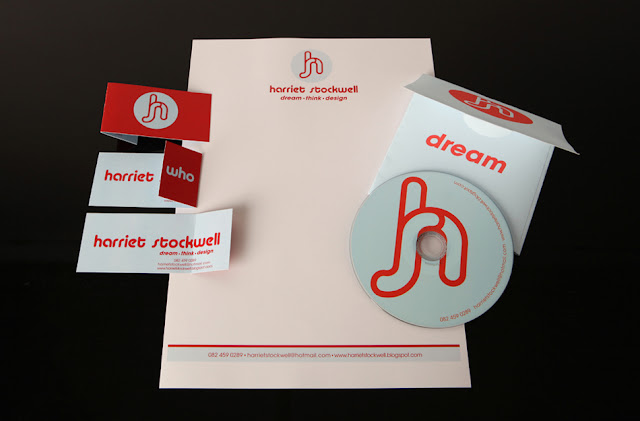
Corporate Identities
Wednesday, December 7, 2011
Sappi "Ideas that Matter"


Data Visualisation


Here we ran a survey to find out how much individuals smoke, what they spend on smoking and then what they really want. So to show visually information about how much one could be saving to by what they want if they gave up smoking and how long it would take to save. Using Photoshop material goods were made to look like cigarette smoke as if they smoker is smoking away their desired goals.
Thursday, March 24, 2011
My 21st Invites
Freelance Work: Mother City Hikers
100 People to Meet


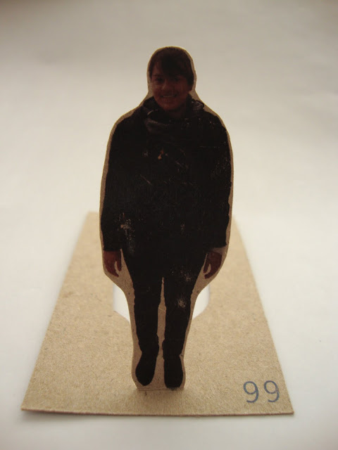
Business Cards is a face to face approach to networking, thus it became my platform for my design layout. Each person of the 100 had a "business card" with their full profile picture on the front and a description about themselves on the back, with the oppotunity to write down your telephone number and e-mail address. I left those last two things blank for the person to fill in themselves because it makes it more interactive and personal when swopping contact details with someone. The profile pictures of the people are also die cut so you can place the business card on your desk and the "person" looks like they standing up. Just a cool and different way of presenting a business card that makes it more interactive than just a flat piece of card.
Subscribe to:
Comments (Atom)


